Design system components & Ops
Overview:
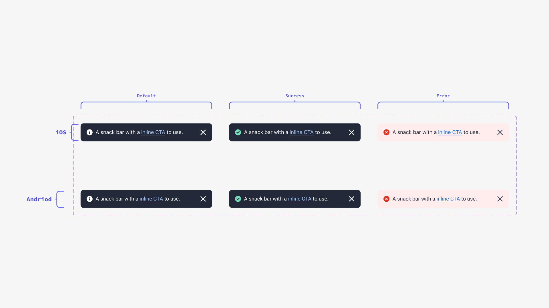
For this project, I was tasked to address and improve the Snackbar component within ShopBack, which has garnered substantial feedback regarding its design and functionality. Currently, the Snackbar is used for both error and success cases, featuring a dark color theme and inconsistent icon usage.
Stakeholder:
Accounts Team
UX Research
Product Manager
My Role:
User Research, Wire-framing end-end, visual design, and interactions. Design Ops. Design systems.
The Challenge
Till now, the design team have found the UI inflexible, with limited color options, unclear usage guidelines, and a lack of content clarity. This has led to several teams creating custom Snackbar solutions or relying on the existing Design System Snackbar, which further exacerbates the problem.
By refining the Snackbar component, we strive to establish a more cohesive and adaptable user experience, taking into account the various use cases, icon integration, button placement, and guidelines for auto-dismissal and content presentation.
Research & approach: Learning from teams
To outline the depth of the team's concerns across different business units and product features. I conducted a design jam workshop with 4 teams with over 7 people, UX writers, and product designers to gain deeper context on the uses cases, mutual problems faced, and questions on guidelines and content use in snack bars components today.


This led to several useful insights that scope the requirements and context of the new component design. as seen below:
Inflexible UI: Unnecessary icons, oversized dismiss buttons, and the desire for multiple buttons create usability issues.
Limited color options: The grey color scheme relies on icons to communicate success states, and error options can be jarring.
Lack of text emphasis and long format options: No available long format Snackbar to accommodate more text.
Inconsistent fill sizes: Text-hugging design leads to visual inconsistency.
Unclear auto-dismiss duration: No guidelines on the appropriate auto-dismiss time.
Ambiguous usage guidelines: Unclear when to use Snackbar for dialogue, when to use dismissable Snackbar, and lack of guidelines for floating Snackbar positioning.
Vague content guidelines: Unclear character limits, truncation rules, currency inclusion, and text formatting.
Confusing or obsolete items: Uncertainty regarding when to use white or dark Snackbar and when to use a floating or sticky Snackbar, as well as the necessity of a sticky Snackbar.
Competitor analysis on key design systems:
To set a clear anchor that guides the future conversation. I deeply analyzed the documentation of the guidelines and the components of popular design systems. From this, we were able to derive a solid definition and use case of snack bars for our guidelines and designs for us to use in order propose a solution and direct conversations
Guiding principles
Drawing on insights gained from benchmarking and contextualizing stakeholder requirements and use cases, I have established three key guiding principles to inform future conversations and decision-making processes:
Contextual in to the system operation triggered
Snackbars provide relevant info to the operation
Concised and Informational
Snackbars are to the point and system-oriented
Light weight non-disruptive notifications
Snackbars should not block user journeys
The solution:
To address the identified issues, our proposed solution includes:
Icon toggling: The ability to enable or disable icons as needed.
Dismiss button flexibility: The option to remove the dismiss button when not required.
Customizable type & character limits: Adaptable text formatting and character count to cater to diverse requirements.
Inline CTA functionality: Enhanced user experience with dynamic call-to-action options.
The flexible icon changes: Allowing for versatile icon integration.
These improvements will provide greater flexibility in call-to-action length, ensure the layout does not restrict content, and accommodate various CTAs.
Additionally, non-auto dismissive snack bars will be introduced, which will persist until the user takes action or selects the close affordance, offering enhanced user control.
implementation of component
The creation of the component comprises of leveraging of Figma’s component capabilities. To stay up to date with design system best practices I follow Figma’s best practices and nest our design components’ states and variations in a single component allowing for a better user experience.
The allows for a single dashboard designers can use in order the access different states without breaking the component enabling better adoption.
Deprecation of old systems
This also includes systematically deprecating old components and recording release notes to the team to ensure clear communication of the new component with the rest of the design teams.
Building the existing library
The proposed improvements to the Snackbar component not only address the current issues but also contribute to the expansion and enhancement of ShopBack's design system library. By refining this component, we are reinforcing the commitment to create a consistent, adaptable, and user-friendly suite of design elements that cater to a wide range of scenarios and use cases.
DS governance and advocations
Educating teams & appreciation for Designs systems
A crucial aspect of ensuring the successful implementation and adoption of the improved Snackbar component and the design system as a whole lies in educating teams about its benefits and fostering an appreciation for design systems which is are essential for their successful implementation and adoption
As such I held a final sharing session that not only introduced the brand new snack bar but also took the opportunity to educate the process getting there and what design systems really is


