SB Cashout Experience
Overview:
In Q4 of 2022, the company introduces Global level objectives (GLO) in order to improve the user experience of the ShopBack App.
The aim of the project was to redesign and overhaul the ShopBack cashback withdrawal experience to weed out dead-end flow and reduce failed experiences and low-value customer service tickets, saving the company manpower costs.
At the same time, we also had to incorporate improvement goals by other cross-functional teams to achieve bigger goals under this GLO specifically incorporating native biometrics to save on OTP costs.
Stakeholder:
Accounts Team
UX Research
Product Manager
My Role:
User Research, Wire-framing end-end, visual design, and interactions. Merging legacy flows with updated flows.
The Challenge
High drop-off and failed withdrawals due to unclear flow & communication With an increasing amount of users on the App, power users and new users alike struggle to understand the requirements and relevant actions to withdraw their cashback resulting in an increasing number of failed withdrawals and dropoffs. This miscommunication of requirements and poor legacy user flow has led to a frustrating end-customer experience that needs to be fixed.
Rise in CS tickets to CS agents
Increased bounce rates
Attempts to delete their SB Account
From period of October 2020 to 25 April 2022 the total number of tickets solved by agents totals at 913.5k. Of which, 47.8k tickets (~5.2%) are related to cashout. This overall volume is expected to rise with ShopBack entering into new markets.
Opportunity - Legacy verification methods used
On the verification end, the current legacy system relies only on OTP verification to approve the transaction, as a result having extra costs run up despite the availability of biometrics on phones.
The Objective defined
💡 Objective 1 Reduce the number of failed withdrawals and tickets sent to CS. And to increase user retention & satisfaction.We’re also looking at how we might bring the users to experience and benefit from other ShopBack features when they failed to withdraw (cross-pollination).
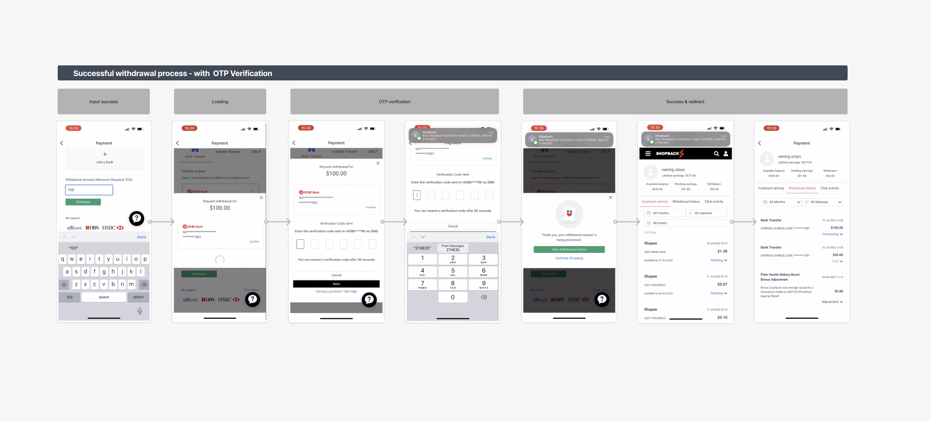
💡 Objective 2 Integrate a smooth verification experience and transfer the legacy mobile web flow to app
Research: Unpacking the problem
Collaborating with the UX research team & UX writer we conducted a UX audit & delved into CS tickets to understand these frustrations & failed attempts.
Using data on Amplitude, Zendesk and metabase. It was discovered that the failed withdrawal attempts were caused, among other things, by not having reached the minimum amount of withdrawal when using the bank transfer or e-Wallet method or not verifying their account before the withdrawal.
In summary, users had 3 critical groups of tasks to complete in order to be eligible.
01: Verified accounts & Payment methods
A foundational requirement for user to tap on the withdrawal feature. Without a verified account and KYC they cannot withdraw
02: Minimum withdrawal amount hit
Every country & payment method has a different minimum withdrawal amount but this is not made known to users clearly.
03: Correct input amounts
Users hand to input a minimum amount otherwise it would not be eligible


However, in the legacy flow, it was apparent that a communication breakdown was present due to 3 factors:
01: Poor communication and information architecture
The current withdrawal page does not educate users on the requirements they have to fulfill.
Hierarchy of requirements not clearly communication from most to least important
02: Requirement not made known clearly, only at the point of mistake
Error states only appear at the point of input instead of upfront leading users to have a bad experience.
Critical Information is hidden.
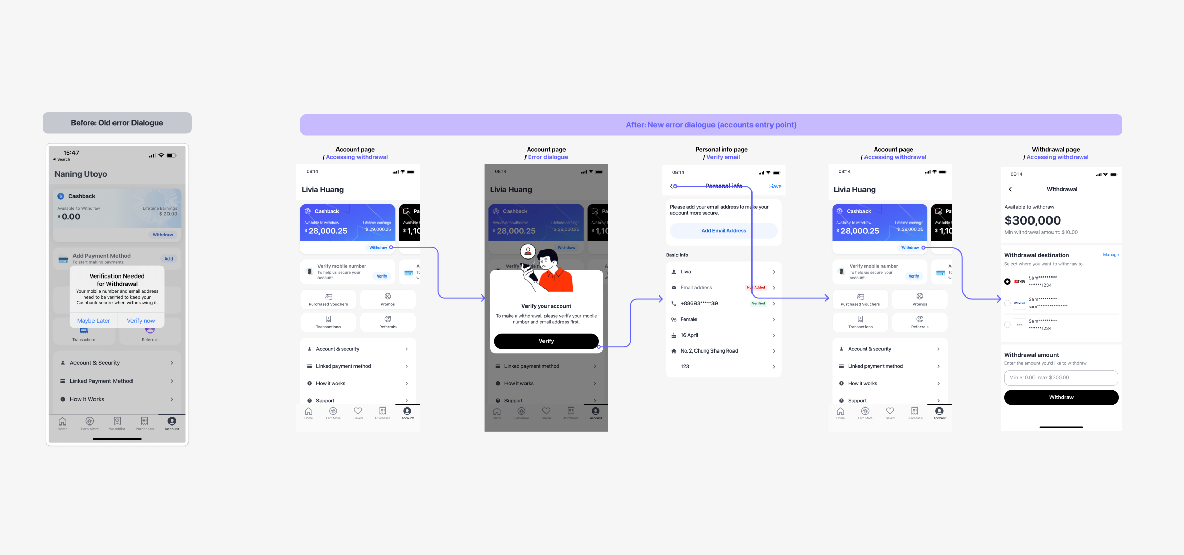
03: Poor error handling and no clear actionable
Dead-end loops as errors do not provide instructions to help the user move forward.
Defining Design principles:
Before jumping into design, I created some key guiding UX principles to keep the team focused on the right priorities. It also helped us improve the decision process of the team, reduced arguments and brought clarity on what matters.
Guiding users and keeping them informed.
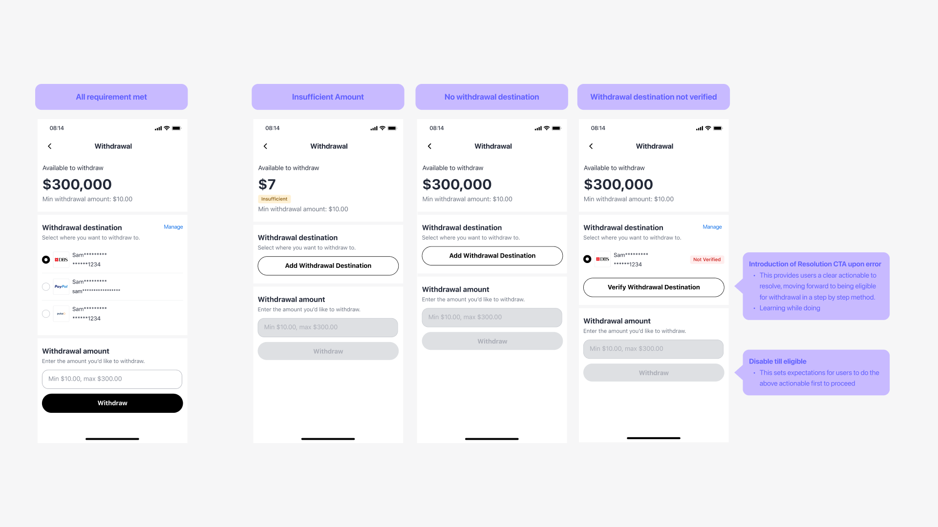
The flow should intuitively guide users to learn the requirements at a glance before moving forward.
Provide context progressively.
Users progressively learn how to hit the eligibility criteria without feeling overwhelmed.
Clear Resolution actions for errors.
Users should clearly know the next actionable to resolve errors at the point of encounter.
The Solution:
To solve this problem, I thought big and mapped out the whole end-to-end withdrawal experience. I started to identify the choked points of the legacy flow and work with multiple stakeholders to align on the hierarchy of the requirement for withdrawals and how it should be communicated to users.
With a mutual alignment, we reorder the requirements to be communicated in a 3 steps process that progressively guide users to the next step once they have completed the requirement of the previous step. By introducing this new flow, expectations of the requirement were clearly set for users, and resolutions CTAs were available to guide users forward meaningfully.
Overcoming Constraints: Working to combine legacy flows
Due to limited engineering capabilities & a legacy database, we had the constraint of keeping the payment management section where users can add and verify their payments on the mobile web while updating the rest of the flow on native.
To make it a smooth experience, I was inspired by the flow experience from brands such as grab and Gojek where adding payments and selecting payments were a separate flow.
As a result, I worked closely with the engineering team and backend engineers to devise a way where users only need to come into this section only to add payment methods and pull the data onto the native screen where users can choose their payment method added.
Making it less intrusive and scalable to future improves when we want to change the payment method section to a native platform.
Impact and Evaluation steps
Reduction of Trival CS tickets
Successful withdrawal experiences
Cost saved with the implementation of Biometric services with the Accounts team
Introduction of a measurement plan
Measuring the effectiveness of our UX improvements, I reached out to the UX research team to conduct a measurement plan that tracked using funnel and segmentation analysis the effectiveness of each part of our design.


